Summer Camp Brochure
Tools: Illustrator, InDesign
Timeline: Nov. 10- Dec. 4 2021
Client: A Summer Camp
Problem statement
Design and create an 8 page brochure redesign. The design should communicate your subject, be visually dynamic, provide strong conceptual and visual continuity from cover through interior, use typography, negative space and the grid to effectively provide access to the information to be communicated in the proper hierarchical sequence.
Key question: How to effectively organize heavy text in an effective and thematic way to successfully produce a summer camp brochure?
Process
Thorough research of inspirations, color, and typefaces
Research
Before tackling the designing and sketching portion of this project, I went to Pinterest to create a board full of illustration and theme inspiration.
I knew I wanted to keep a whimsical theme since it is for a children's summer camp, so there is some room for fun with the colors. With the limitation of only having two colors max, it was hard to narrow it down but eventually I decided on purple and orange.
Studies
I knew I wanted to include the colors purple and orange from my initial research, but I felt I needed one my color to bring the design together. I thought about what environment this brochure would be in. I landed on a forest green since a summer camp is centered around being outside with the trees.
Following my research and creation of my Pinterest board, I went to the drawing board to create my color palette.
For the type, I wanted to keep it simple. I knew I wanted to use a sans serif or a typeface similar to Times New Roman so there would be high readability for all people with all limitations.
I did not want to include fancy typefaces that can only be used for a heading or title. I went with Minion Pro to keep the professionalism of the summer camp business and to keep the readability.
Sketches
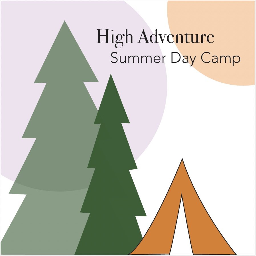
I sketched out three initial spreads for the first couple pages, one including luggage tags for luggage trunks, another with beach ball illustrations in the corner since many children love to play with them at the beach/lake, and then I sketched pine trees for the third spread to create a sense of wilderness since the camp is in the woods in Wyoming. I did not heavily consider where the text would have gone, I was more concerned with getting a theme and layout figured out. I thought the tree design/theme was more effective since the beach ball theme could be perceived as a beach destination rather than a children's summer camp and same scenario with the luggage tags.
Compositions
I created three different eight page brochures based on my three sketches.
Feedback
-Add more to the master pages to create interest and style through the brochure.
-Add more to fill the white space
-Add more on cover page
-Review body text type
Final Composition
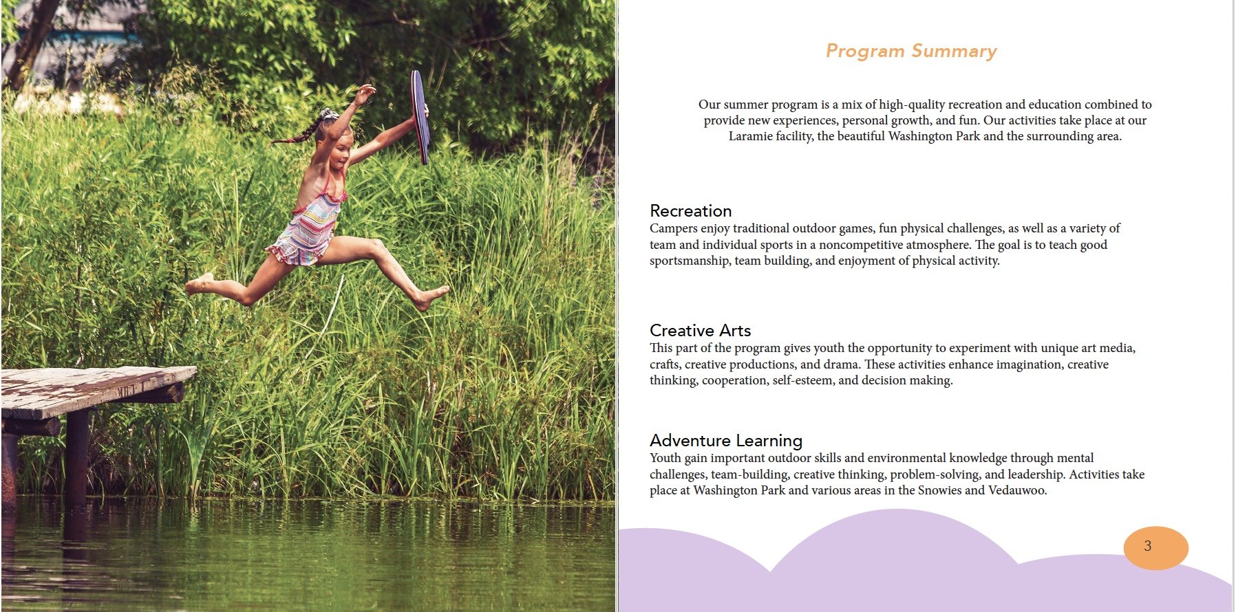
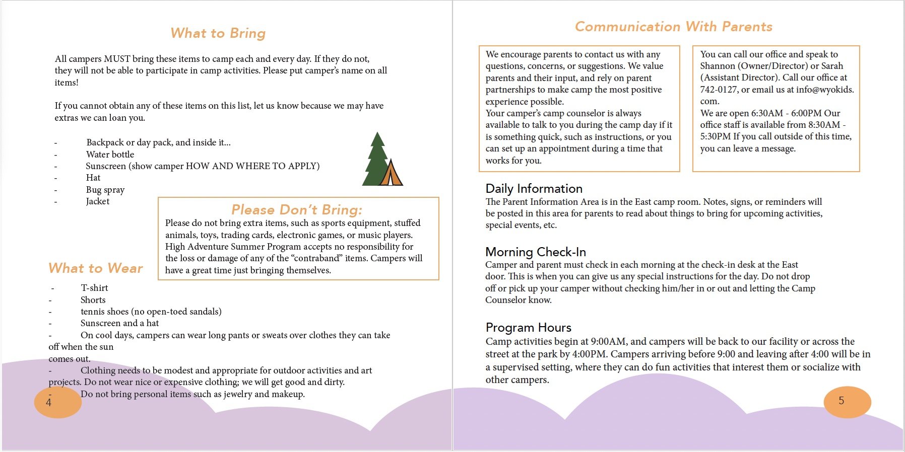
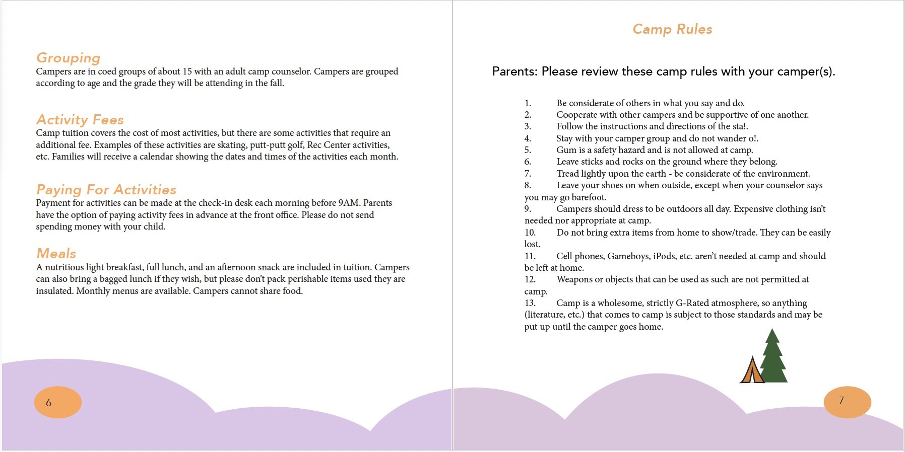
I think my final comp design is very effective! I combined the best elements of each comp to produce a final design that looks amazing.


