Museum Poster and Card Design
Tools: InDesign, Photoshop
Timeline: Oct. 18 - Nov. 8 2021
Client: Artist showcase
Problem statement
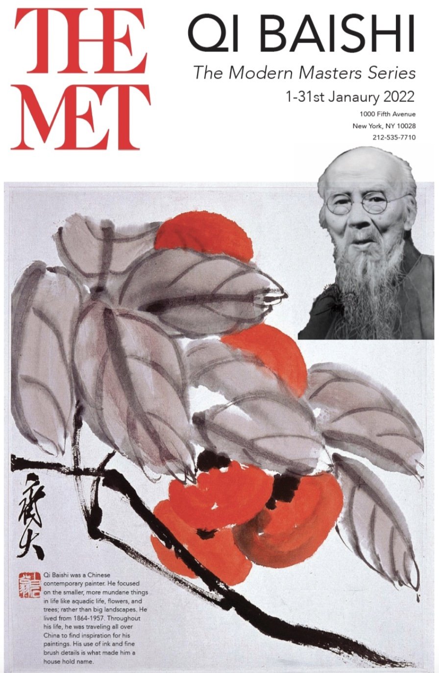
Create an image-based poster announcing an artwork or designer showcase with only a grayscale image of the artist and only using their artwork.
Key question: How can I create a captivating and eye-catching event museum poster and card to bring in crowds of all ages to view an exhibit for a traditional old world artist?
Process
Thorough research of inspirations, color, typefaces.
Research
I initially started looking through Pinterest to gain more insight about what these museum event posters look like and thinking about how designers have played with artists' different styles of work. I found fun designs from Pinterest that inspired me to play with typography, images, and formatting.
The challenge was to use an image of the artwork as the main focus of the poster. I knew I had to pick an artist that had interesting pieces of work and lots of it so I can have a lot to choose from. Here are a few examples of museum event posters that I pinned on my Pinterest.
Studies
His work included lots of water based ink of black, red, pastel blues and greens. He created pieces that were serene and showcased the beautiful countryside of China. That is why I chose to have red and two different shades of turquoise to capture the serene nature of Qi Baishi.
After my initial research, I moved onto thinking about the potential color palettes. I wanted to create a combination of colors that are calming and are included in many of the pieces made by Qi Baishi.
For my typography studies, I knew I wanted to bring some modern aspects to this poster since Qi Baishi is a very traditional and older artist that many do not know. So, I researched many modern typefaces that were sans serifs.
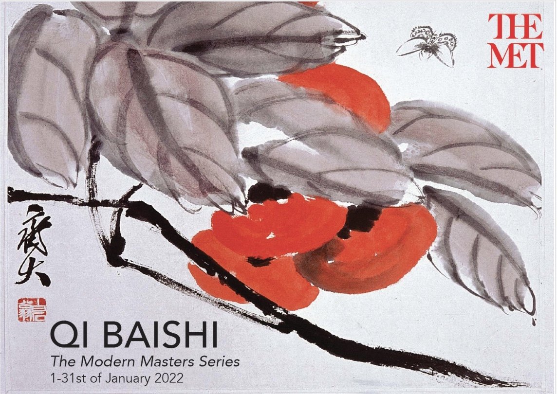
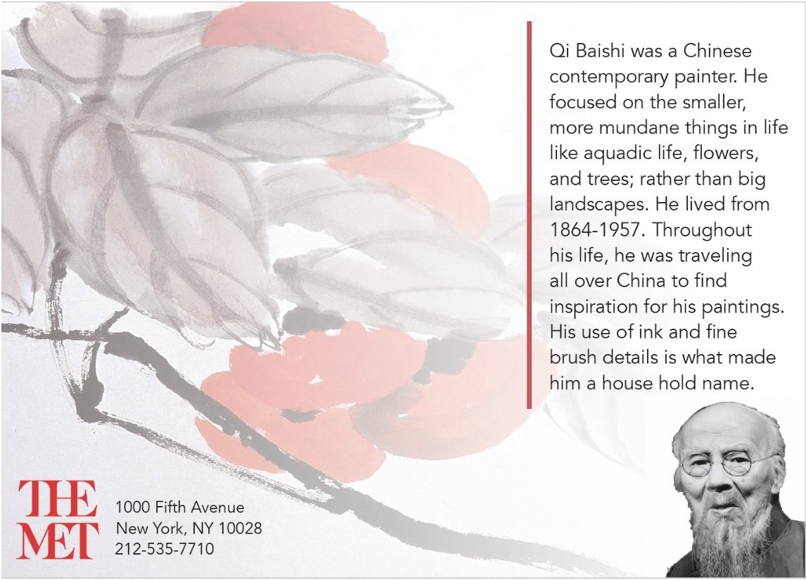
I am always immediately drawn to Avenir since it has so many variations in its family. I used Avenir Black, Avenir Roman, and Avenir Light in the event poster and card. I think the readability with this typeface is beautiful and is very effective. Avenir adds modernity to Qi Baishi ancient techniques.
Sketches
For my sketches, I knew I had to clearly communicate the artist’s style, target audience for the poster, and all the essential information for the event. I wanted one of Qi Baishi’s pieces to be the center/focus of the poster and card with the typeface to be a nice compliment to the artwork.
Compositions
I created three different compositions for the poster design and for the card design. I wanted to design three completely different designs to fully flush out what could work for Qi Baishi. I looked through all of his work and selected the paintings that I thought best represented Qi Baishi’s overall work and style. The first comp I designed included the color palette I created, but with my peers' constructive criticism, I decided to omit the colors and have Qi Baishi’s work speak for itself.
Feedback
With some peer feedback, I was able to revisit my favorite comp and continue to edit.
Final Composition
I am really happy with how the final design came out! I think the use of the flower painting from Baishi. For my final design, I reviewed the constructive criticism that my peers gave me during class critique. I updated the typefaces to be more uniform so now Avenir is the only typeface used on the poster and card.


