Stop & Shop App Redesign
Tools: Figma
Timeline: Oct. 12 - Dec. 13 2023
Client: Stop & Shop
Problem statement
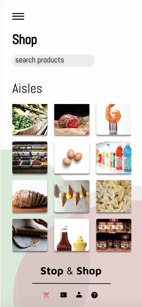
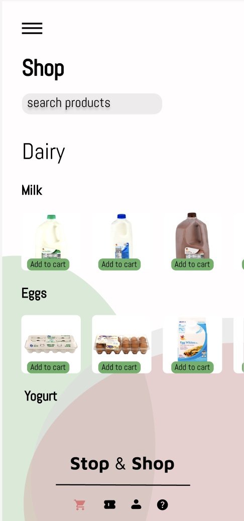
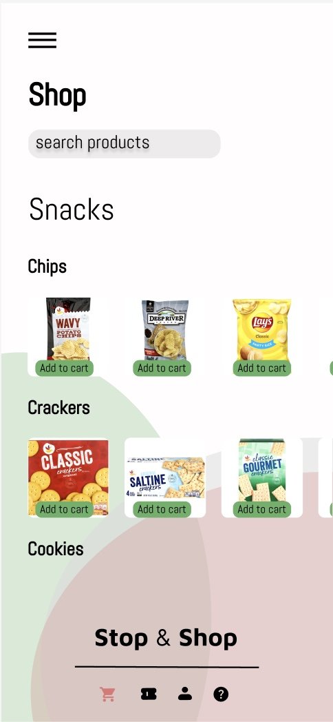
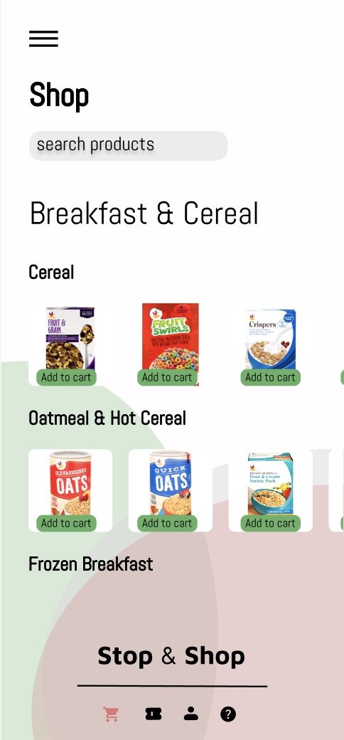
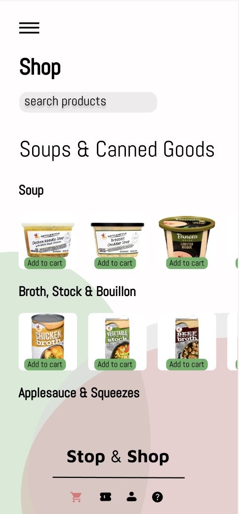
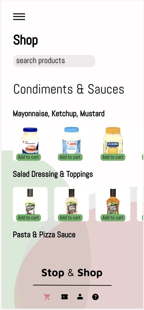
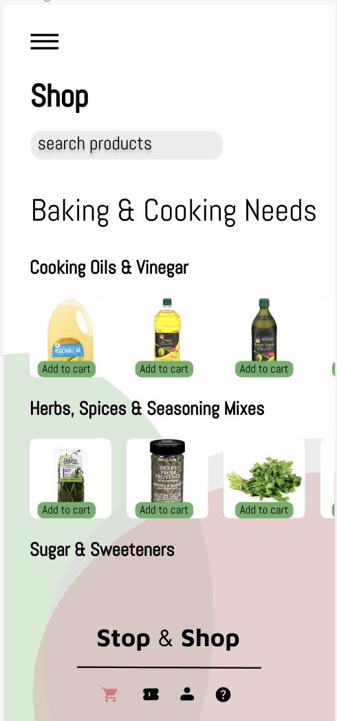
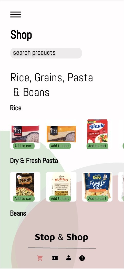
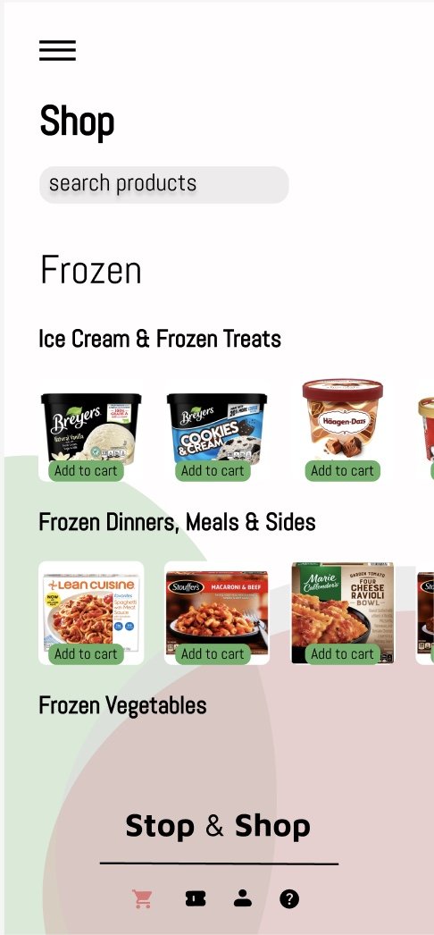
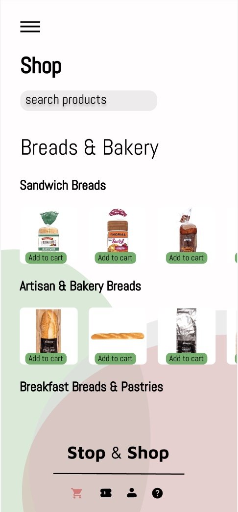
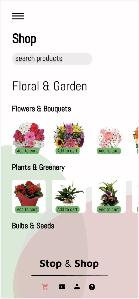
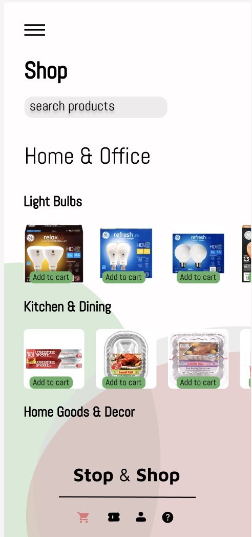
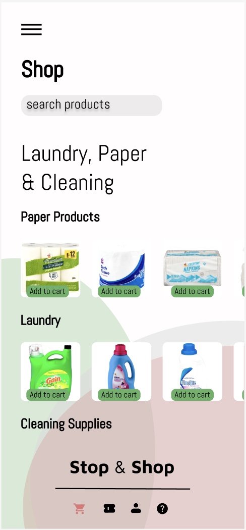
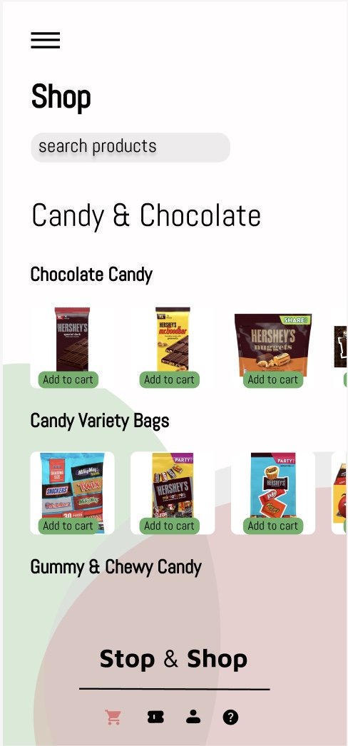
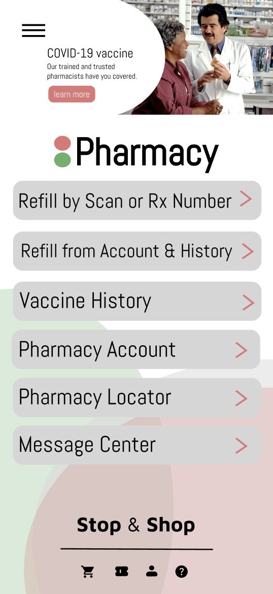
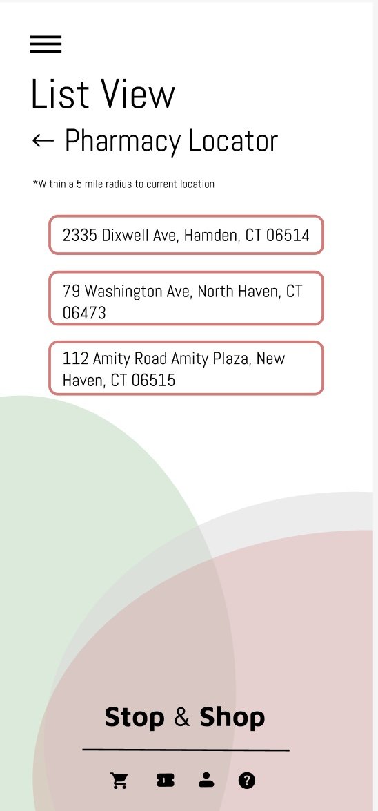
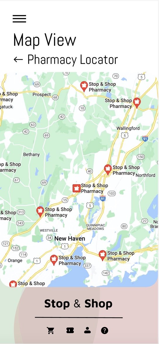
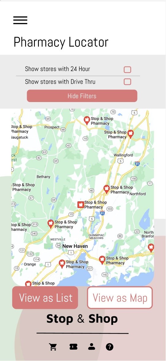
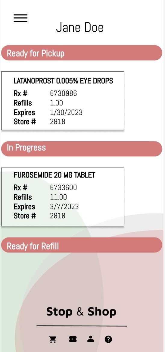
With the current Stop & Shop app there is no efficient navigation, there is a bulky interface design, no additional benefits to existing Stop & Shop customers, the landing page does not open to direct shopping, and the Stop & Shop Pharmacy feature is a separate application.
Key question: How can the Stop & Shop app be improved for an improved user experience for all customers of Stop & Shop?
Process
Thorough research of inspiration, color, and typefaces.
Research
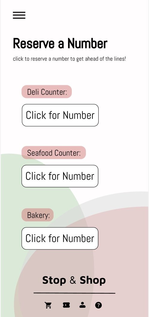
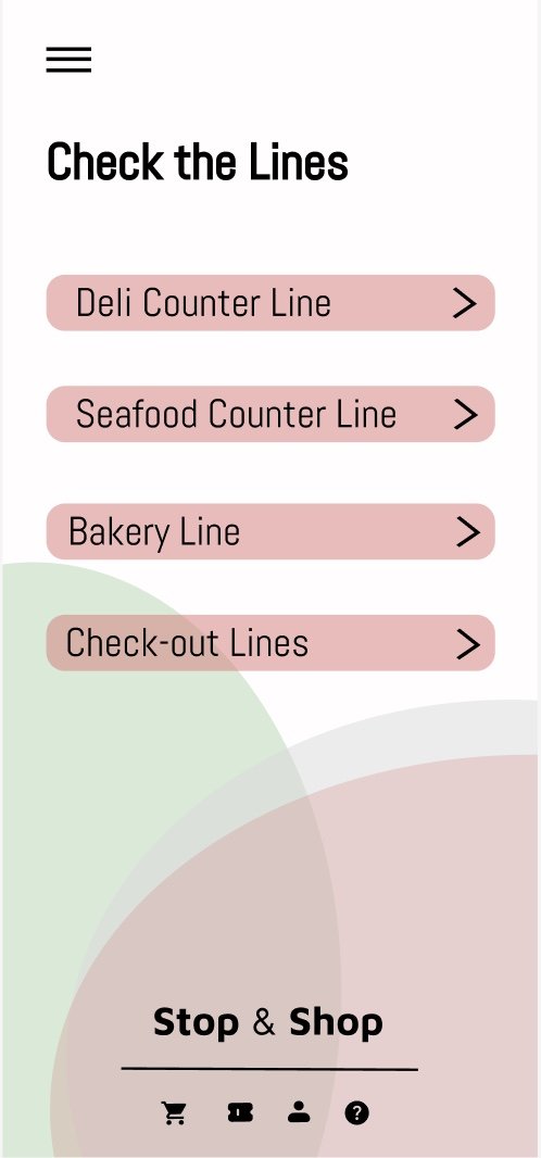
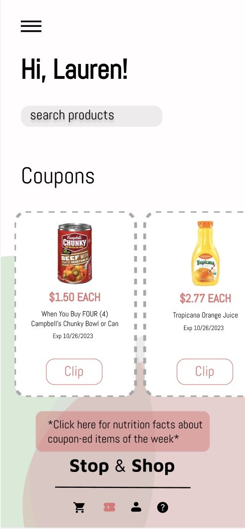
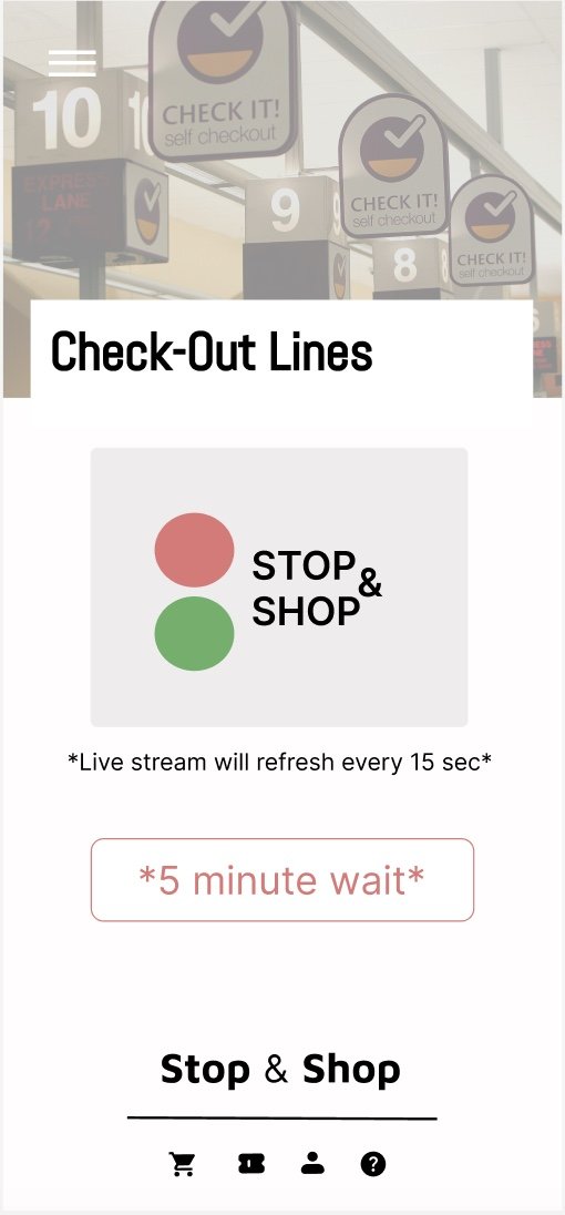
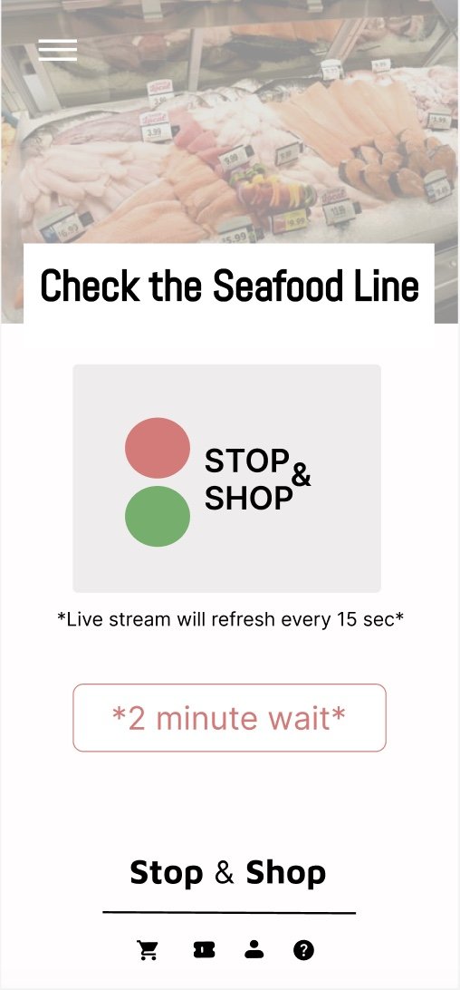
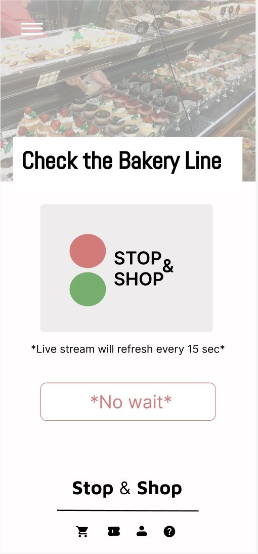
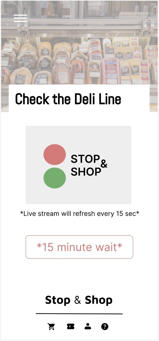
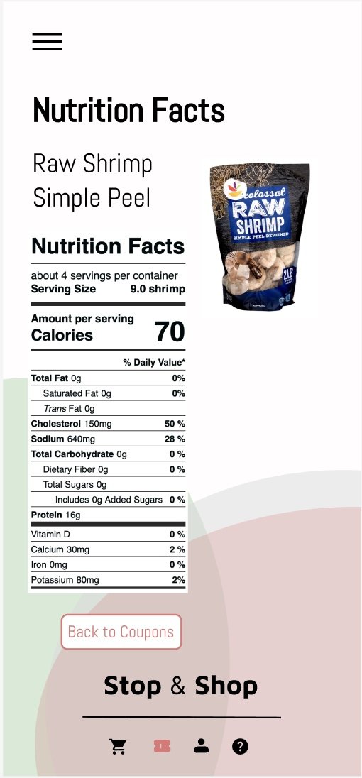
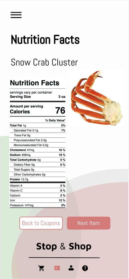
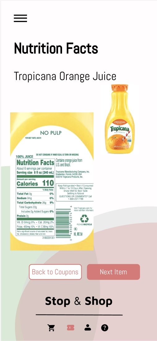
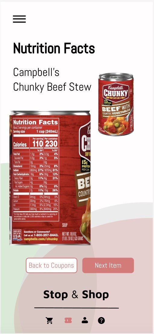
First, I had to understand the purpose of the product. This application is to streamline the process of grocery shopping for the everyday customers of Stop & Shop. With access to new weekly digital coupons, access to checkout line updates, nutrition facts, customers now have the ability to customize their shopping experience.
From the Stop & Shop Supermarket Company LLC. This app has 1,000,000+ downloads, a leader in the online grocery market.
Consumer Lifestyle
• Being successful is more important to Stop & Shop users than to other grocery delivery users.
• Sports are a high interest in most of Stop & Shop users.
• Cars or vehicles are relatively popular hobbies among Stop & Shop users.
Consumer Attitudes
• 53% of Stop & Shop users say that food must be convenient and fast.
• 31% of Stop & Shop users are innovators or early adopters of new products. *per Statista
Studies
I think keeping the color palette limited to only two colors is more effective in order to have a streamlined brand identity. In the app redesign, I only referenced red, green, black, and white in my design.
I wanted to keep the same general color palette as the original app to keep some consistency. Stop & Shop’s colors in 2024 are a vibrant green and red versus the red, orange, green, and purple color palette that was phased out in 2023.
For the typography for the app, I wanted to keep it simple and clean. Keeping with the clean and simple aesthetic, I looked into the sans serif family. I ended up choosing Abel, a modern interpretation of a condensed flat-sided sans serif.
Compositions
After my color and type studies, I created a small sample of lo-fi wireframes in Figma to get an idea of the layout.
Feedback
User testing feedback
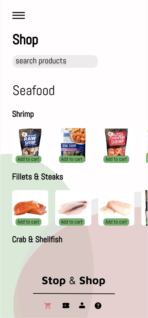
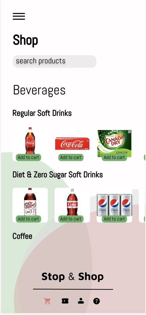
-Have the app open to the shopping portion of app
-Effective use of color
-Change color of icon to indicate what page you are on
-Add more navigation tools-more back arrows
-Add more food visuals
Final Composition
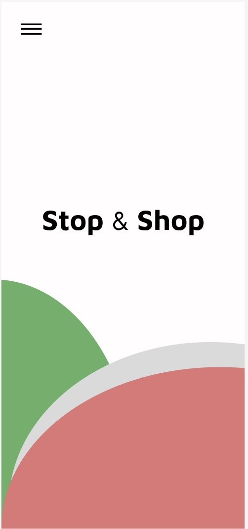
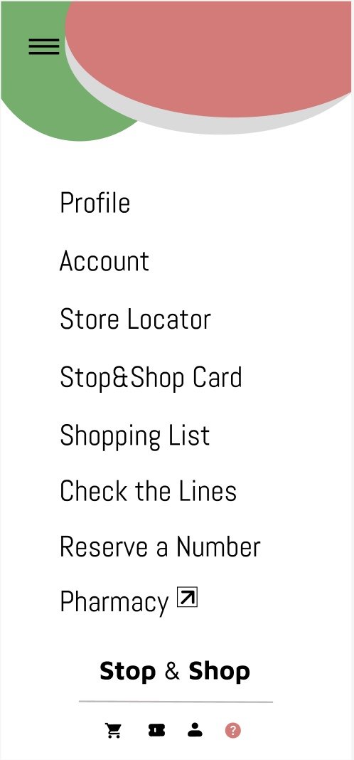
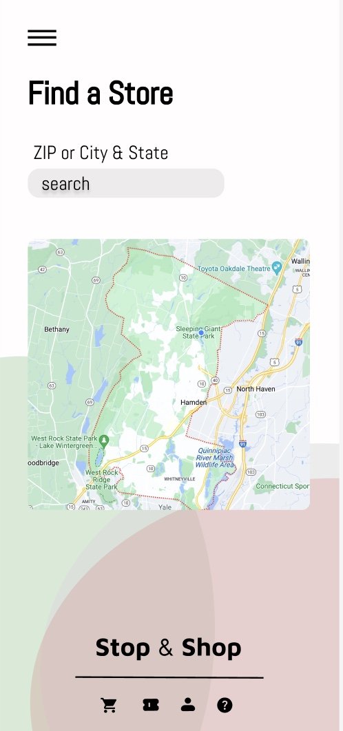
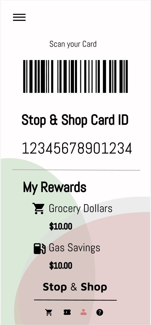
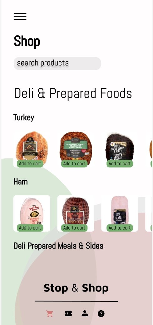
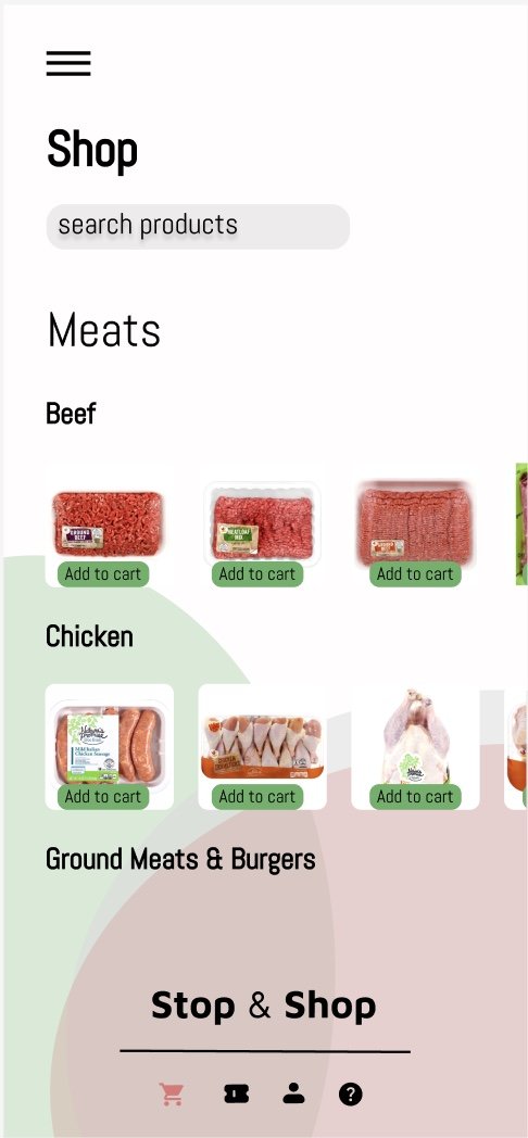
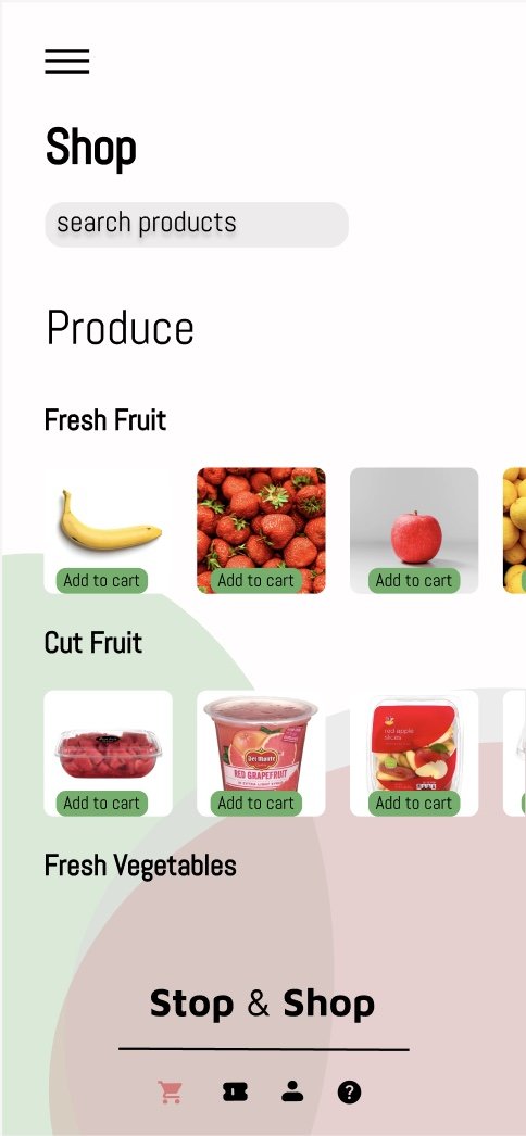
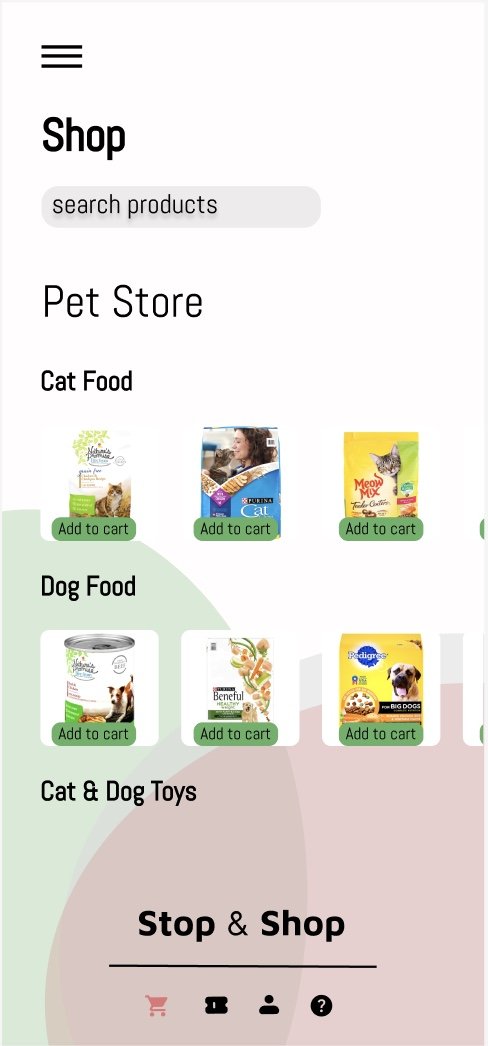
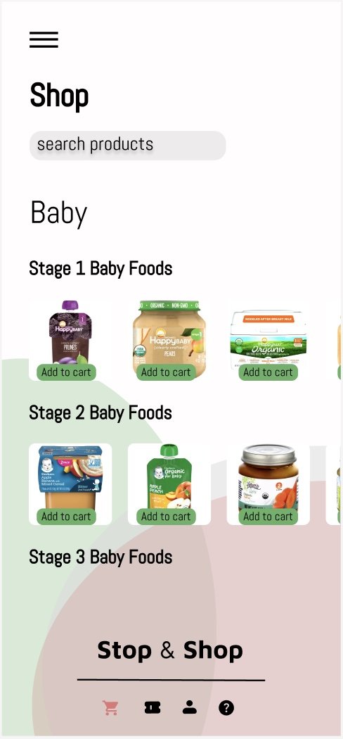
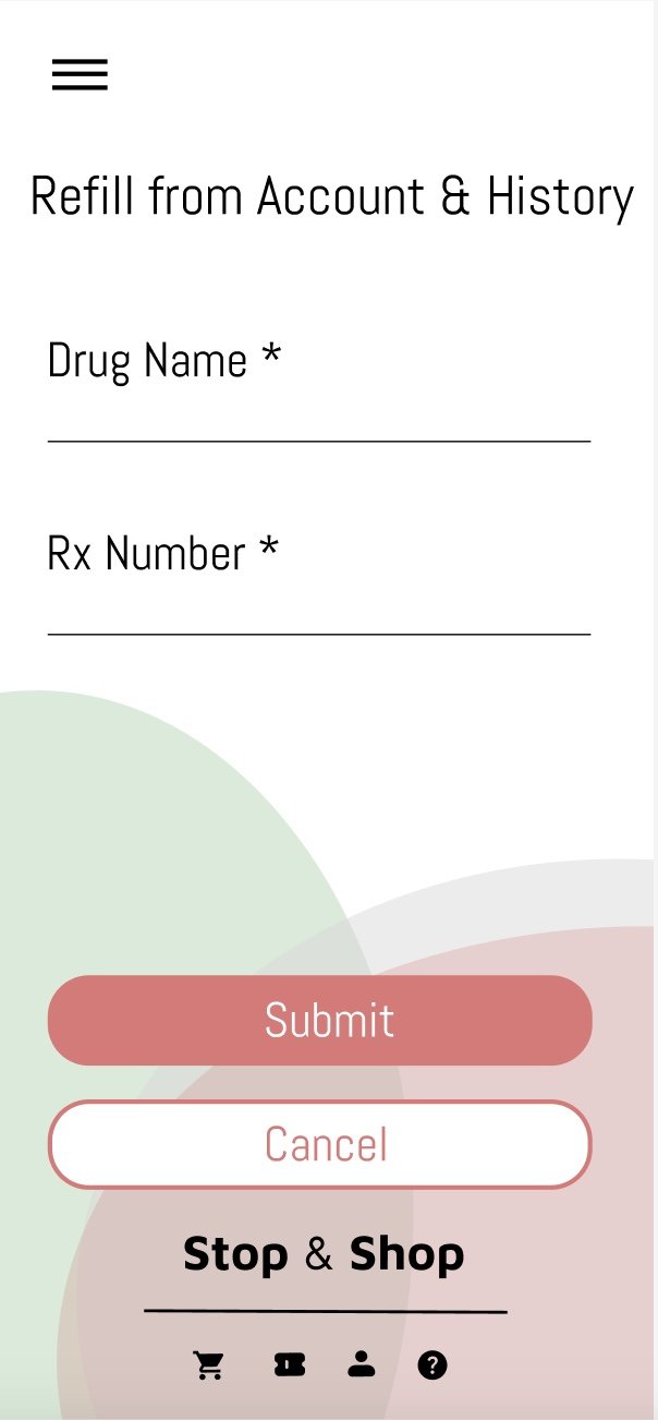
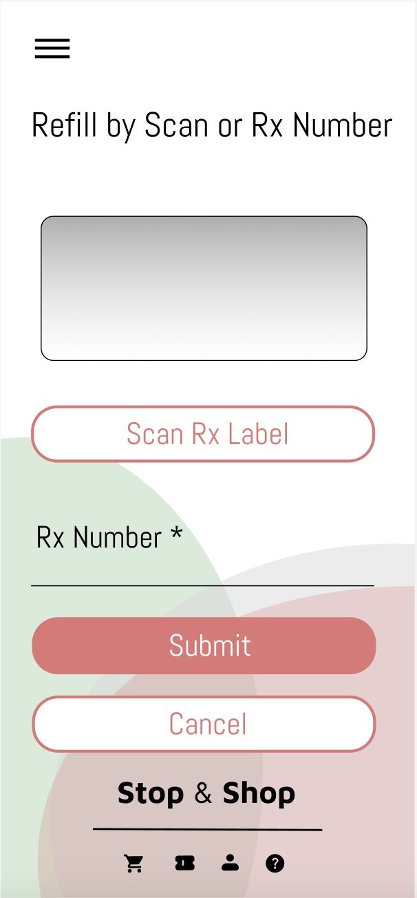
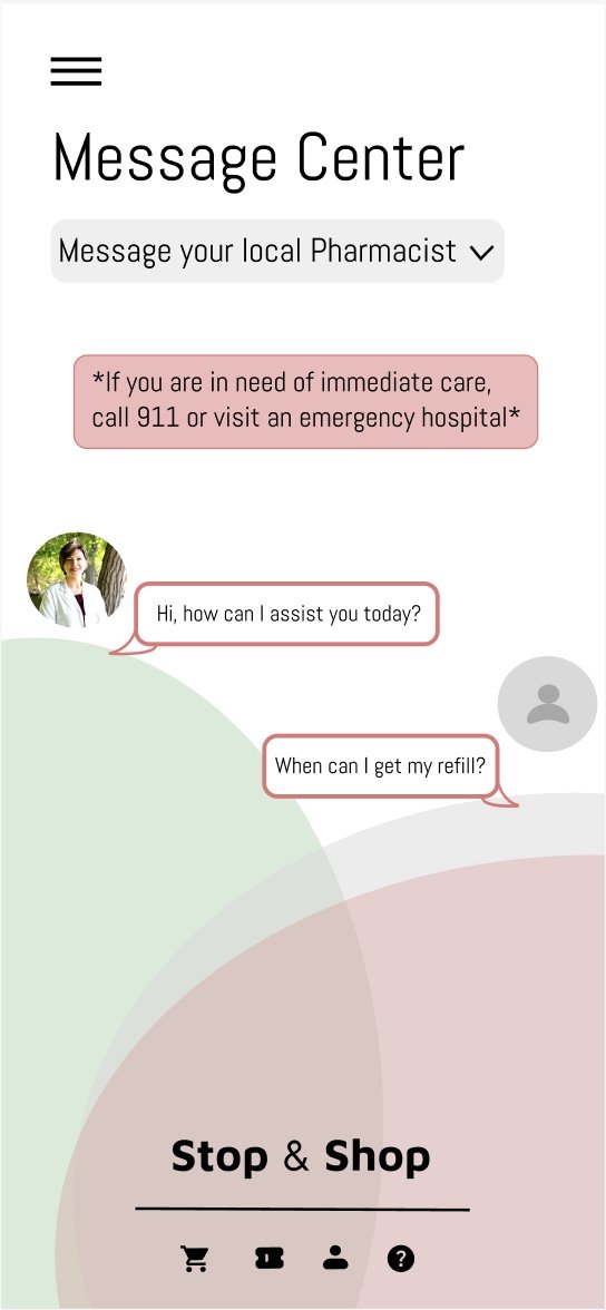
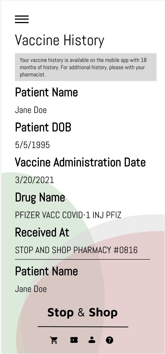
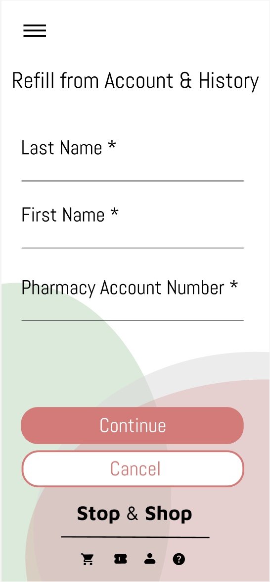
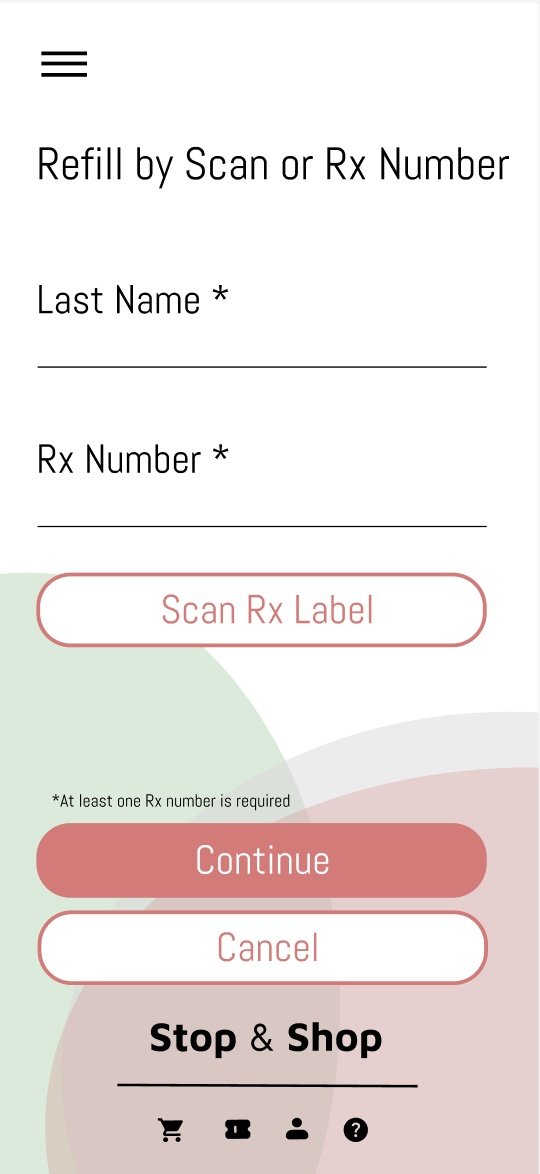
My final design highlights the new features, redesigned old features, and the new in-app additions such as the Pharmacy and Check the Line live updates. I think utilizing the red and green more consistently throughout the app further emphasizes Stop & Shop’s brand identity.
